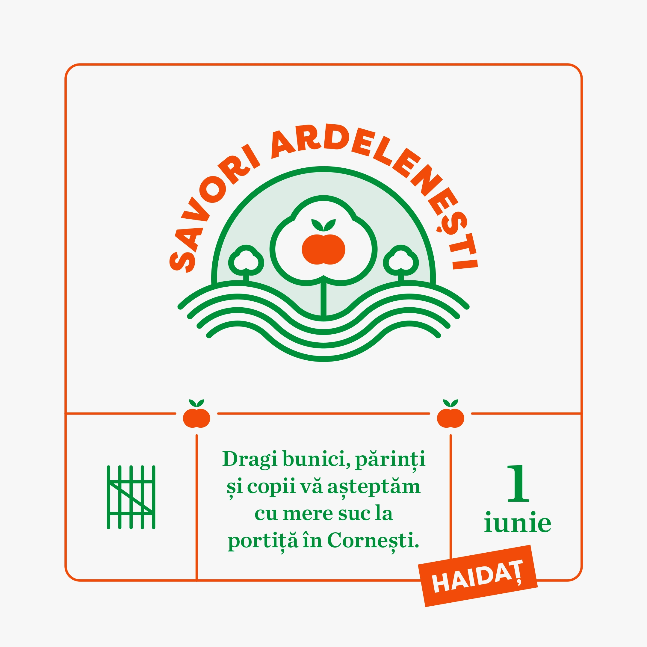
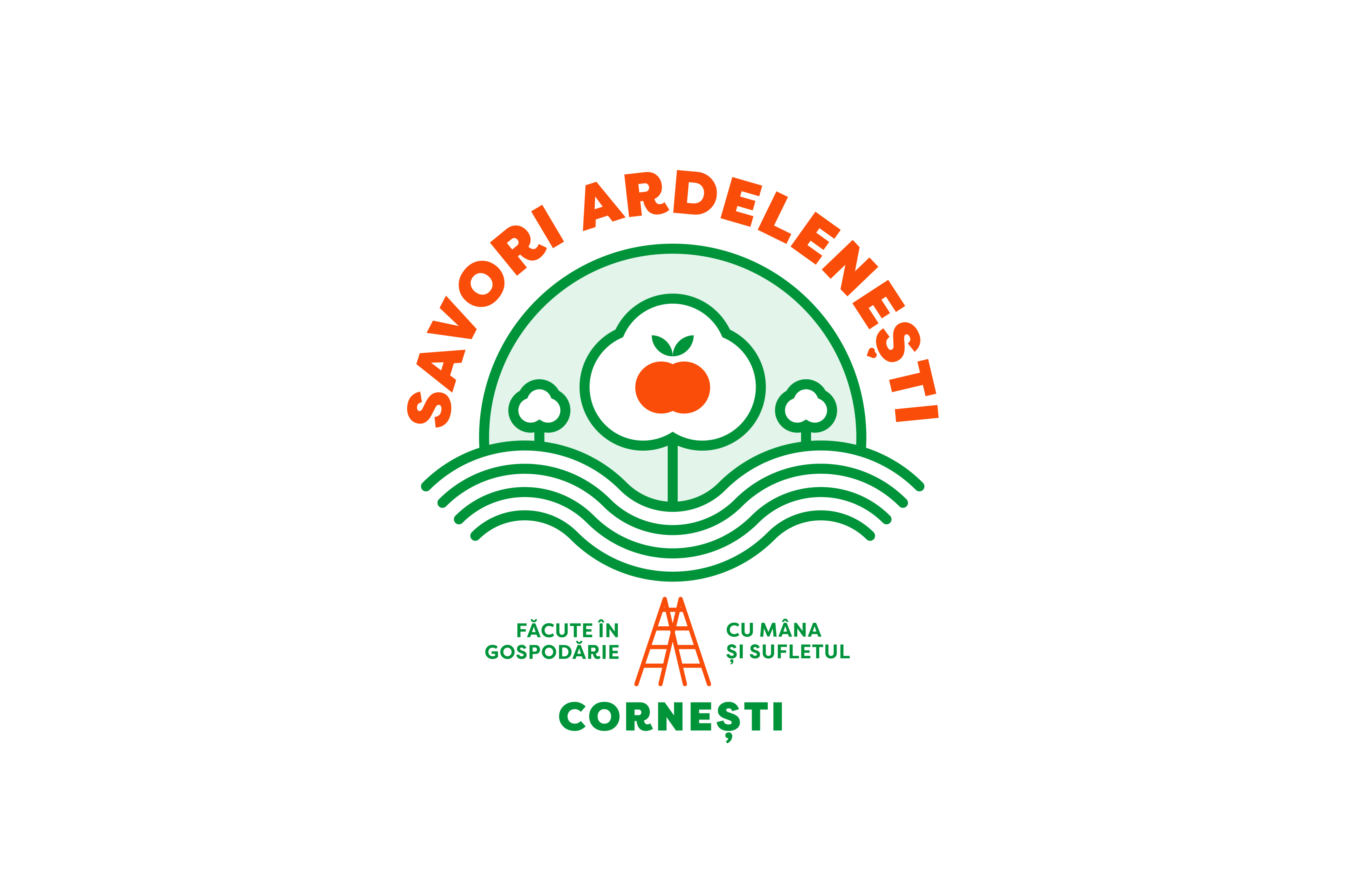
Savori Ardelenești
Savori Ardelenești is a small family-owned food business from Cornești, in the Transylvanian region, producing jams, juices, and traditional preserves. We developed a visual identity built around a folkloric emblem that combines agricultural motifs with a contemporary, geometric language. The system uses bold color, modular symbols, and clear typography to reflect the directness and provenance of the products.
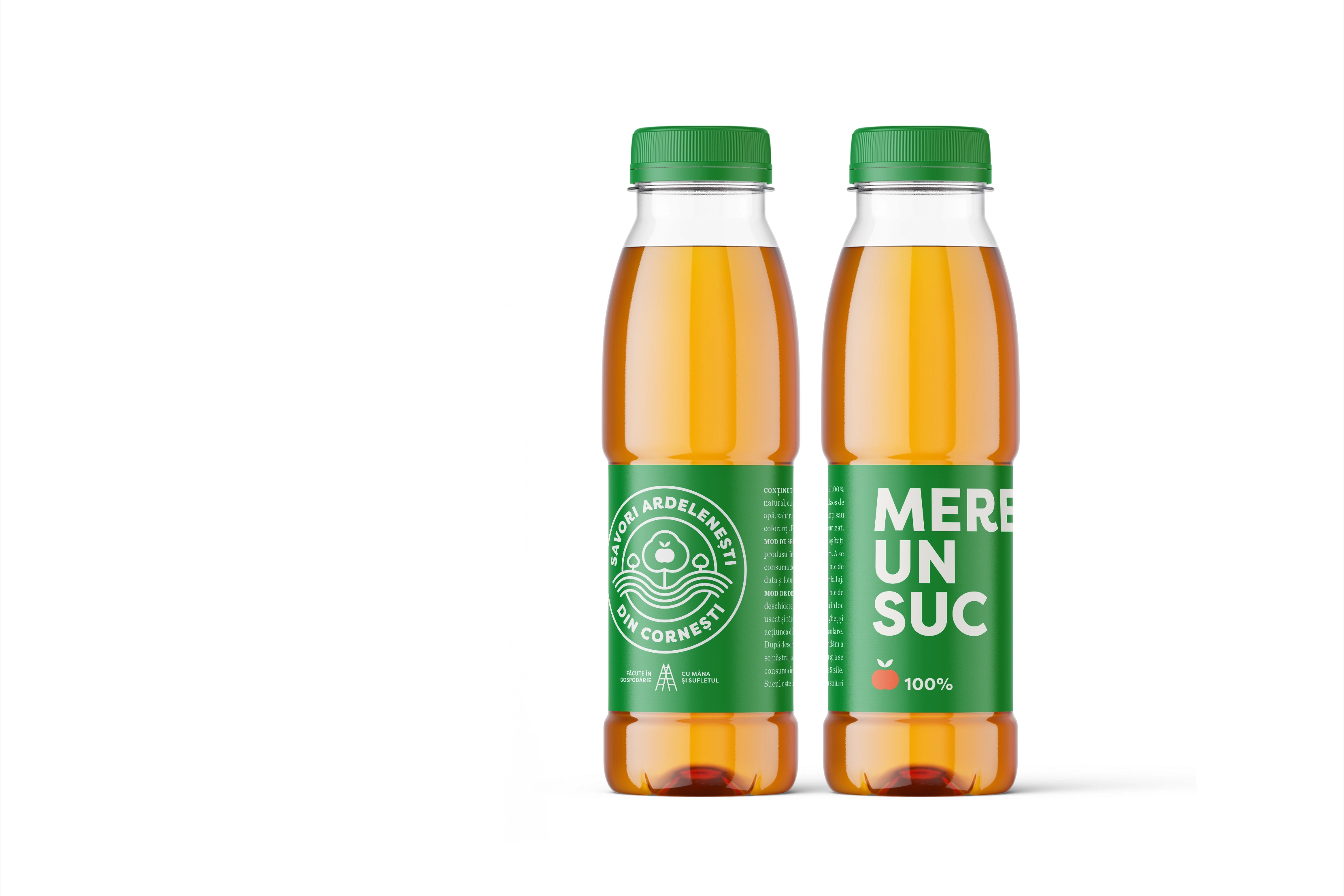
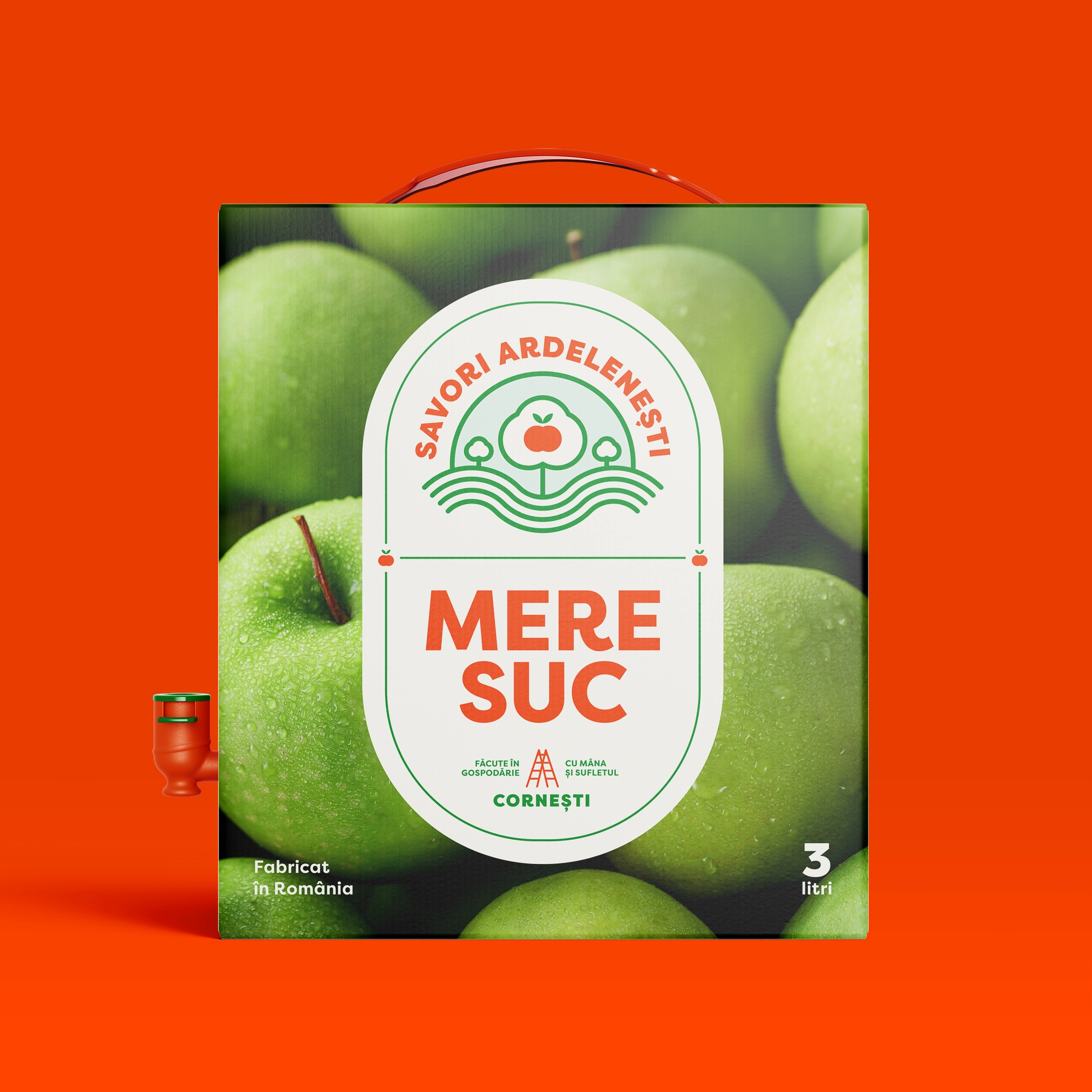
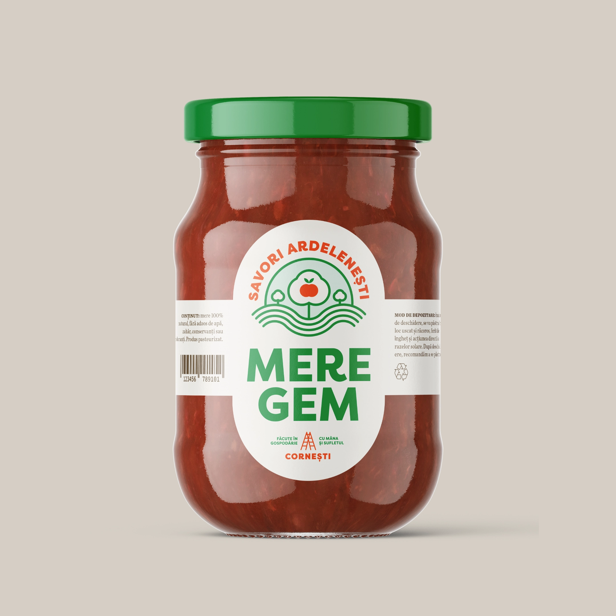
A distinctive aspect of the brand is its use of regional language nuances. In Ardeal, the word mere can mean apples, but in colloquial speech it also functions as a shorthand for merge (it goes / it works / it fits), especially in combinations like mere un suc or mere suc, which can simultaneously read as a product descriptor (apple juice) and an informal suggestion (a juice would be good right now). We used this ambiguity as a graphic and verbal device within the identity to reinforce both locality and brand voice.
To demonstrate how the system performs in practice, we applied the identity to a range of packaging and brand applications. The result is a cohesive visual language that maintains regional character while scaling naturally across product categories.
Info
Savori Ardelenești
2019
food & beverages
brand identity design, packaging, social media


System applied to product formats. We developed packaging proposals across multiple categories to test how the identity behaves on labels, containers, and retail-facing materials.


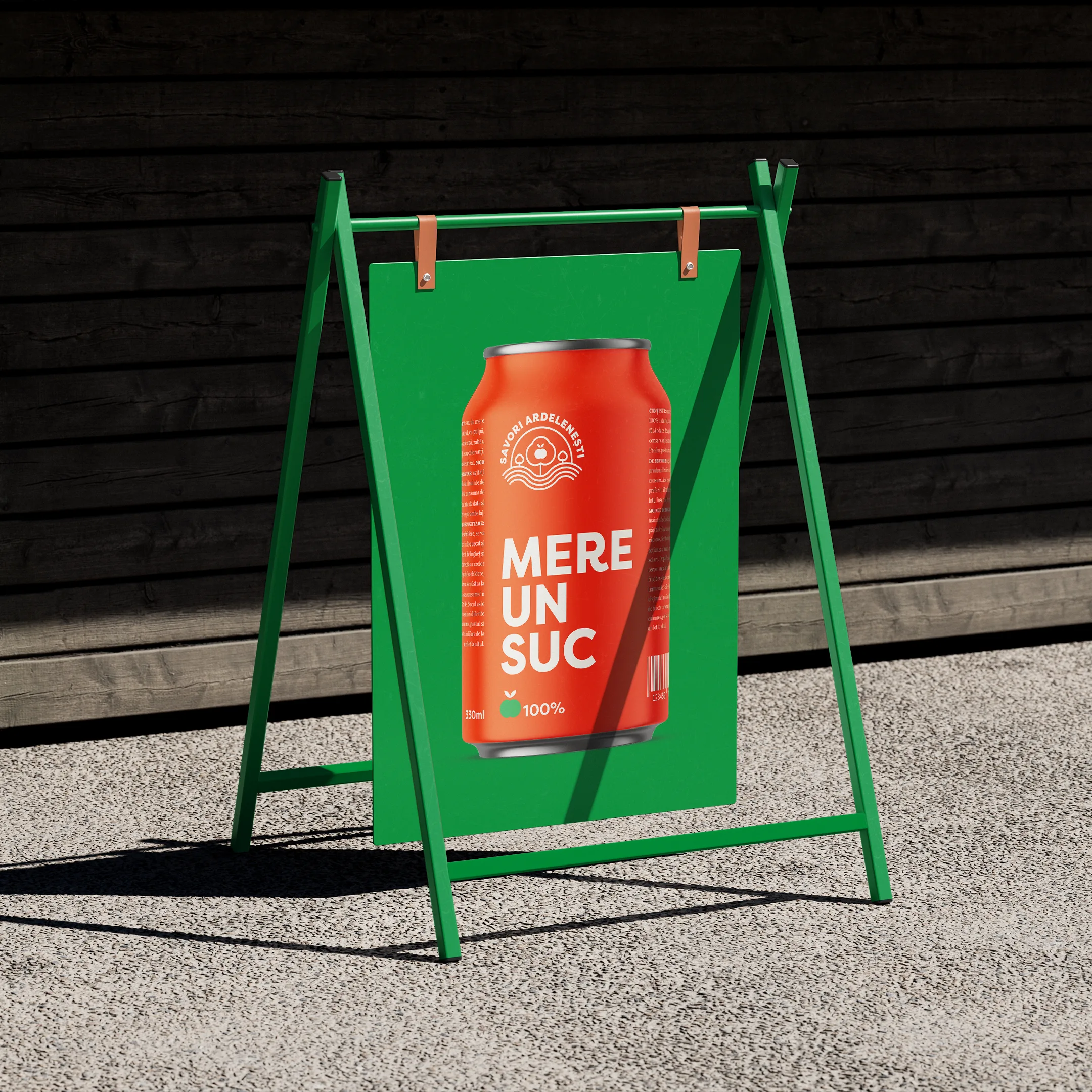
Brand activations and objects. The visual language extends into environmental and merchandising items, showcasing how the identity functions beyond the shelf.


Brand applications. We explored how the visual system performs on small-format items and merchandise, ensuring consistency across diverse physical touchpoints.