Alexandru Patrichi Architects
Alexandru Patrichi Architects is defined by precision, proportion, and control. The project started with the need for an online portfolio, but quickly evolved into a clarification of visual identity.
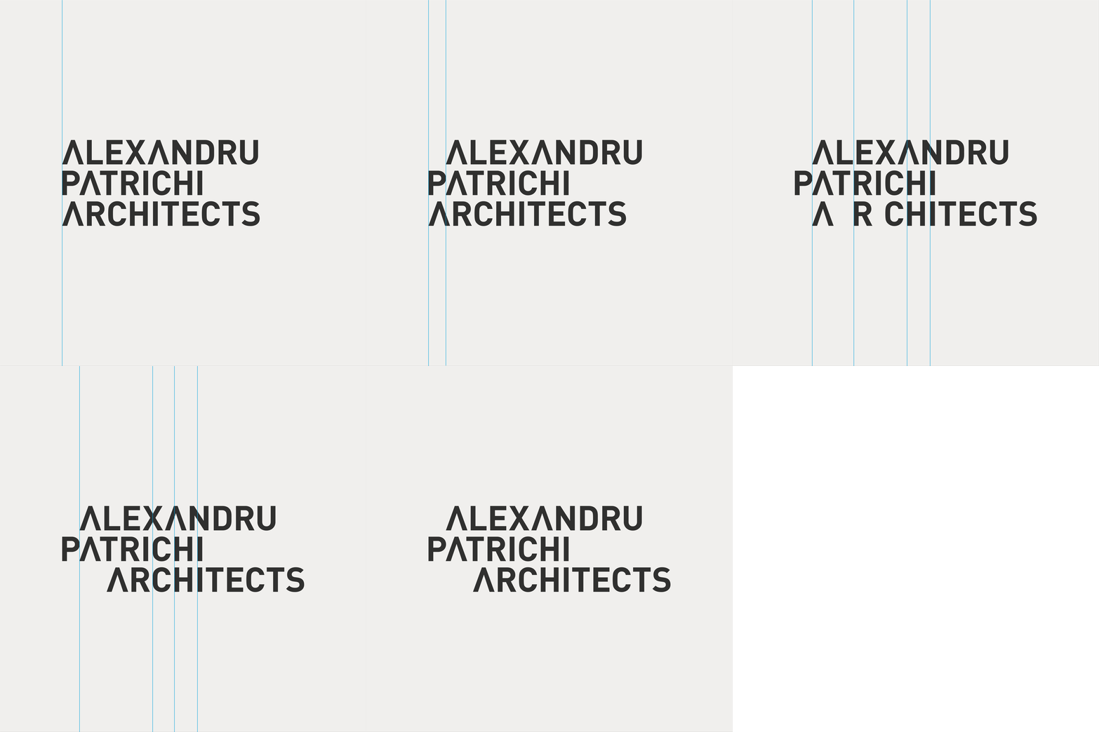
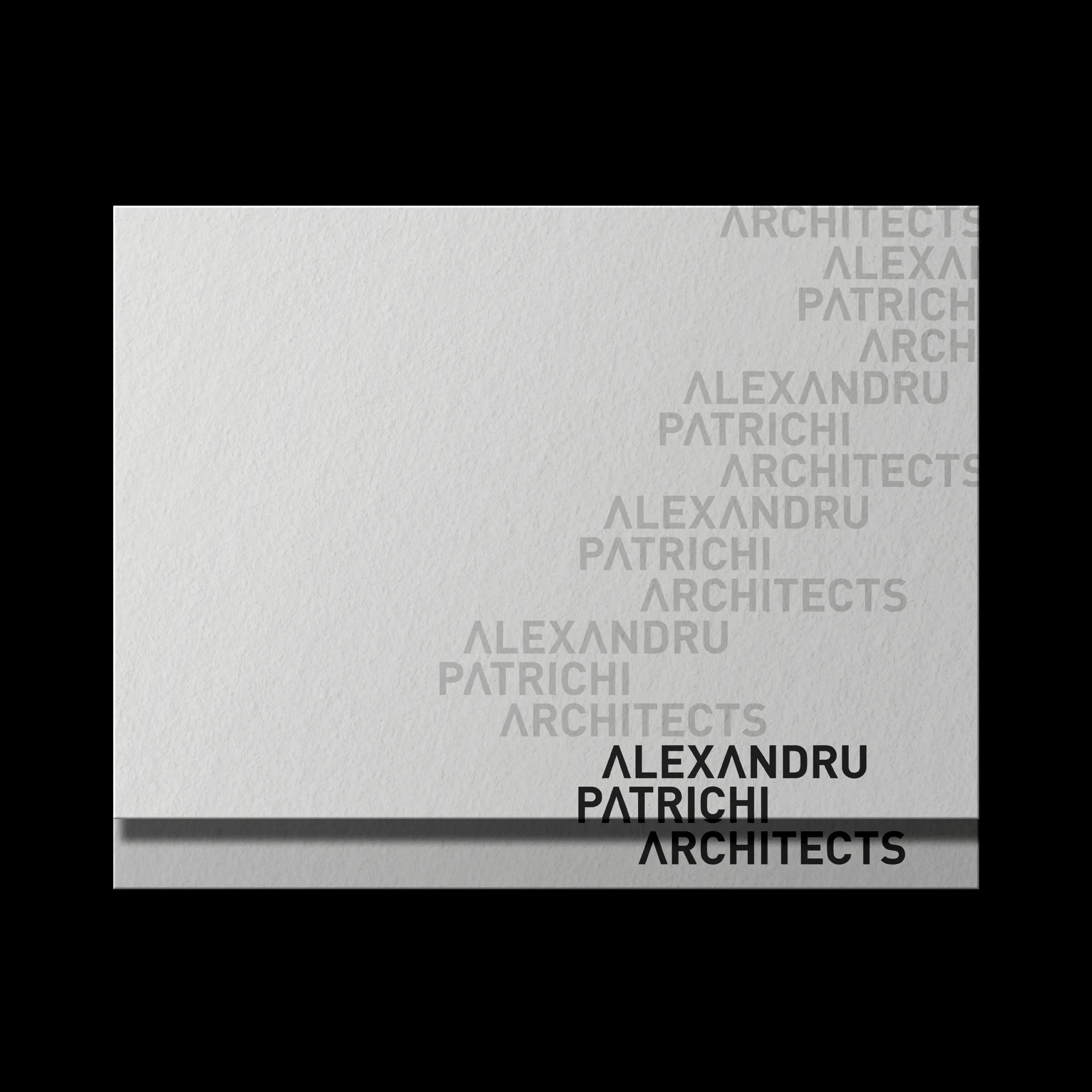
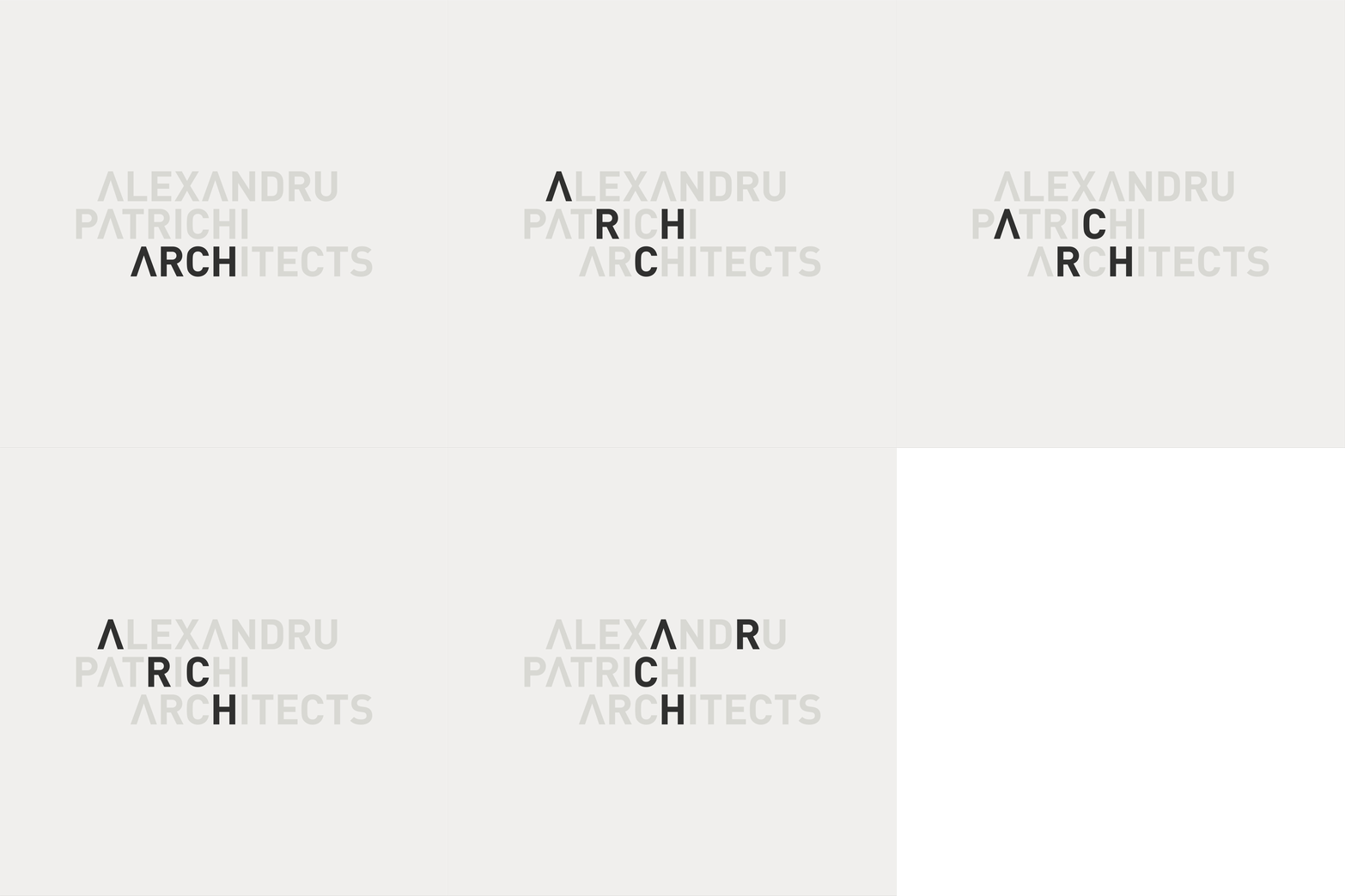
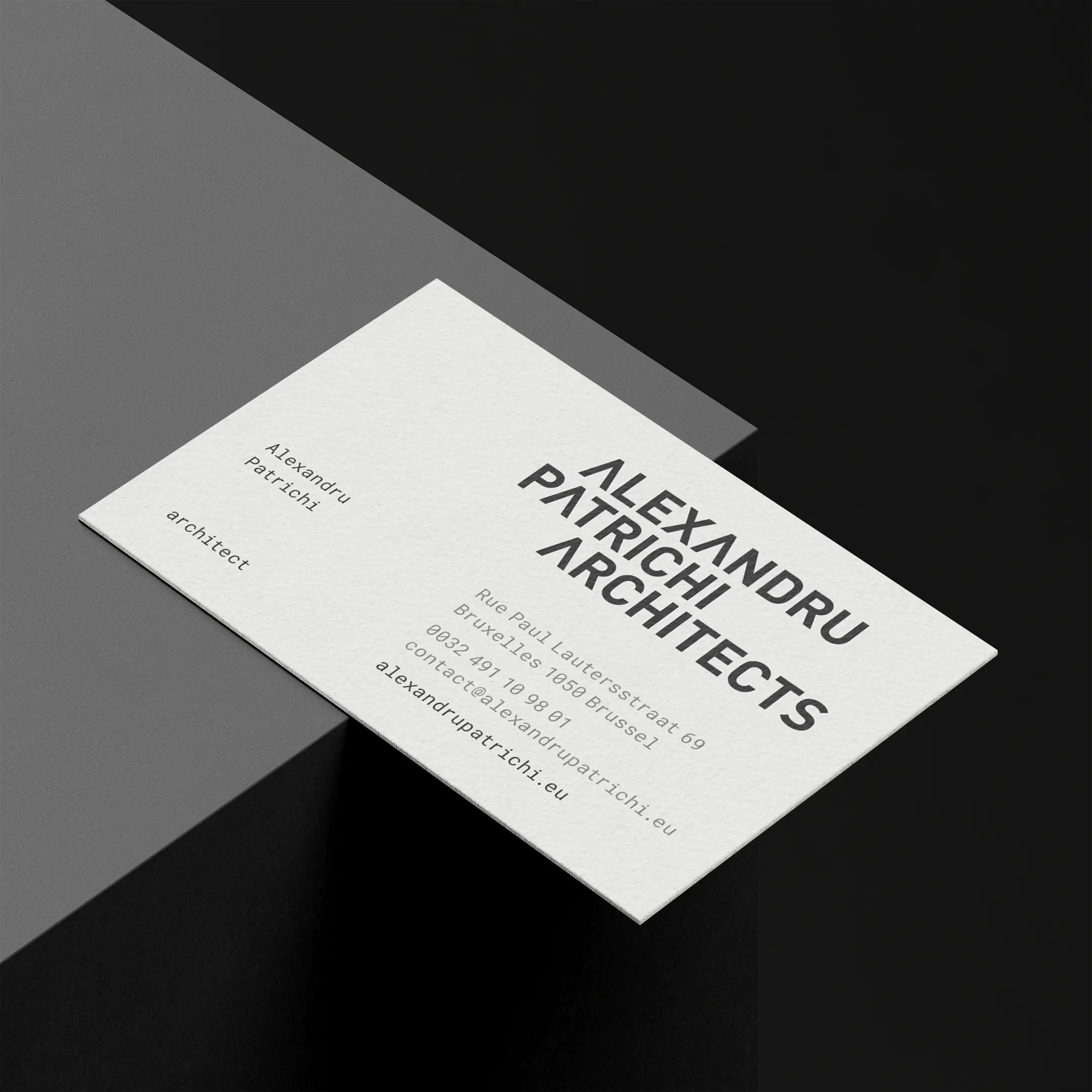
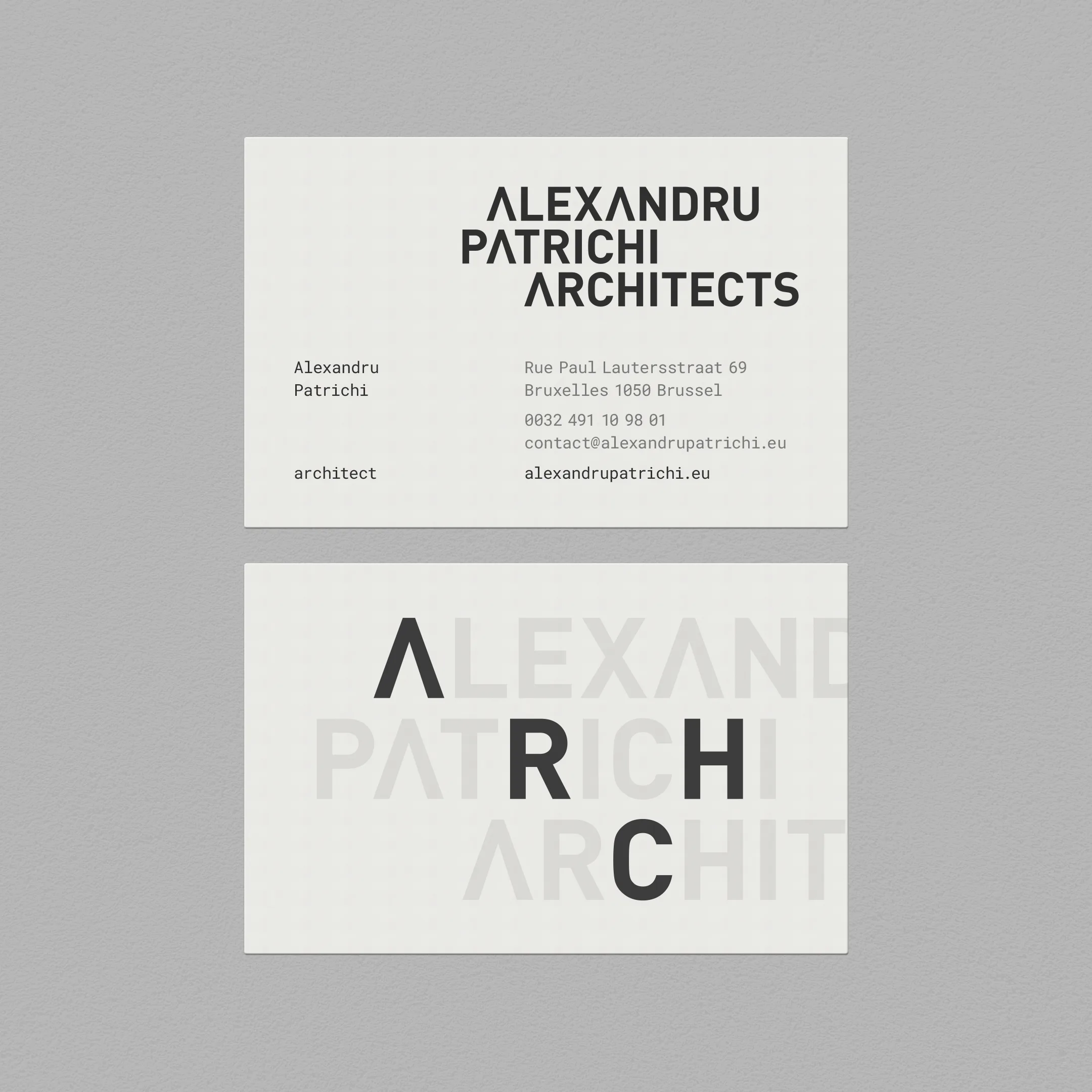
We treated the name as a system, not a sign. The identity builds directly on its structure, making existing relationships visible through alignment, overlap, and selection. The result is not a logo, but a set of rules capable of generating variation without losing coherence.
The following plates outline how these rules operate — from alignment and overlap, to the emergence of a repeatable pattern and the recurring presence of ARCH within the name.
Info
Alexandru Patrichi Architects
2020-present
architectural services
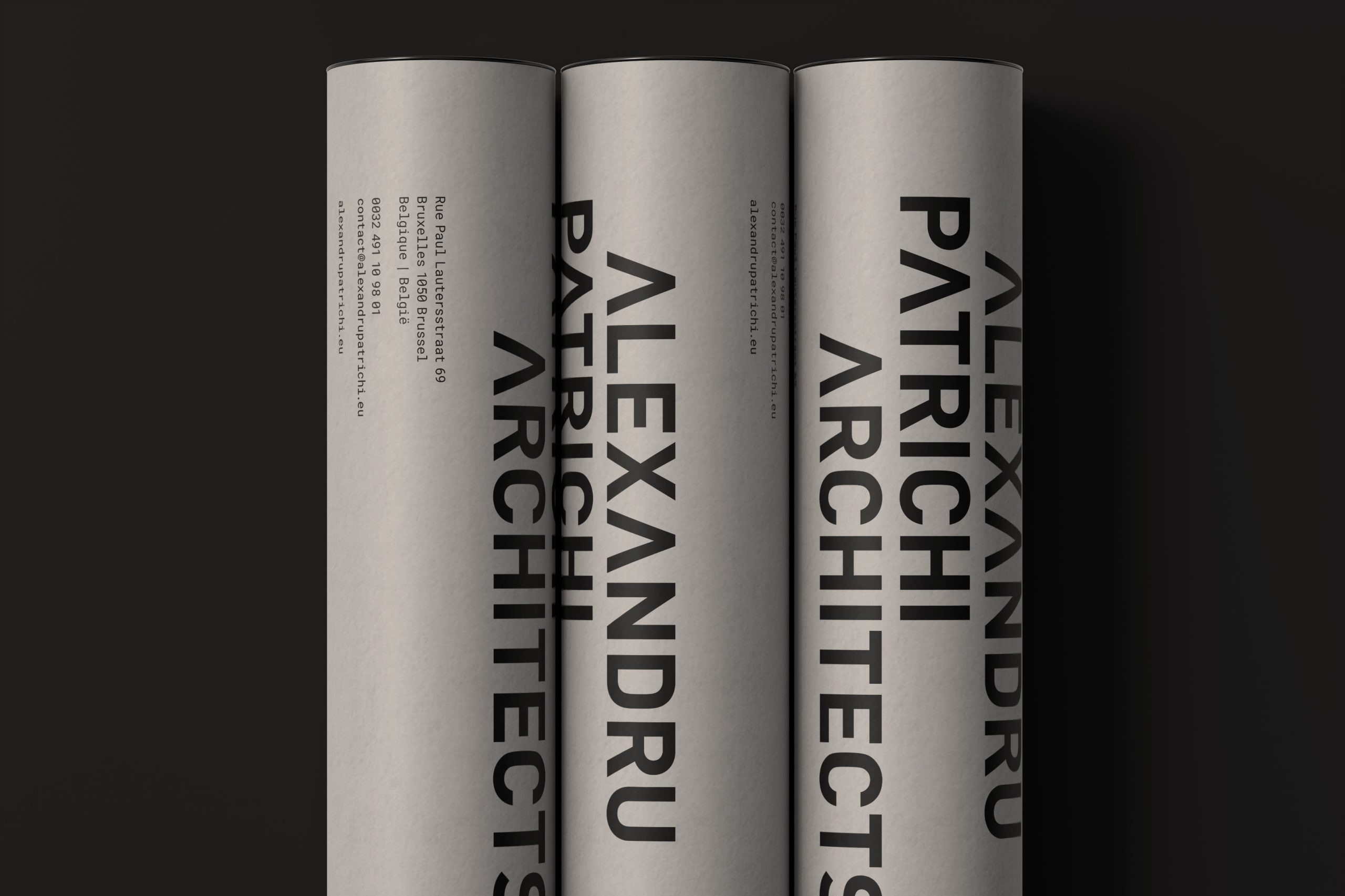
brand identity design, stationery, web design and development

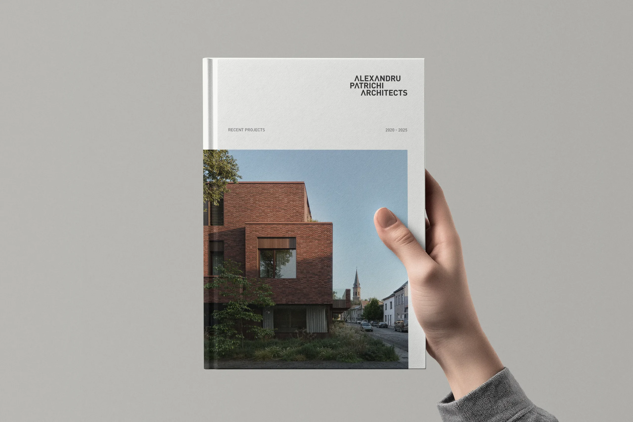
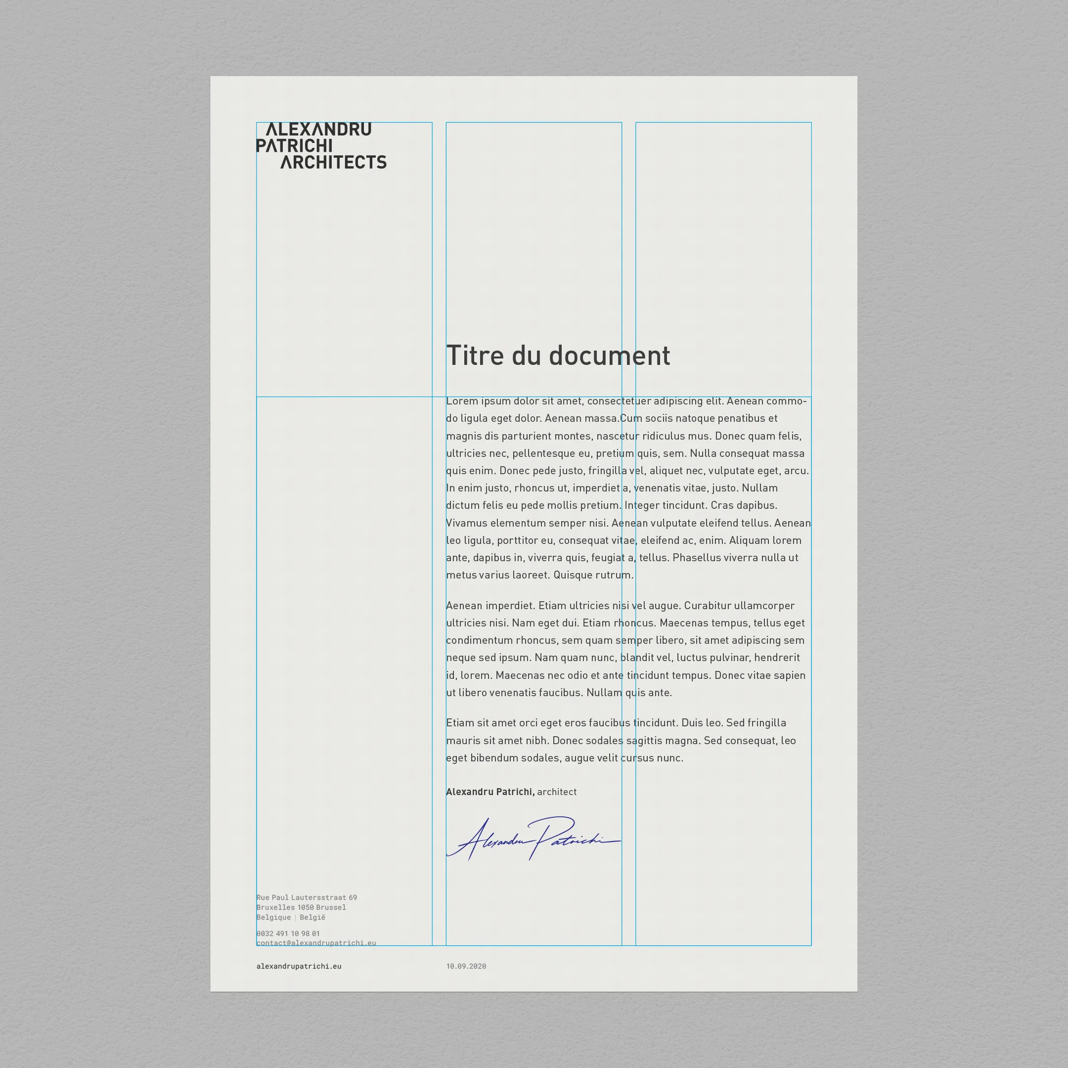
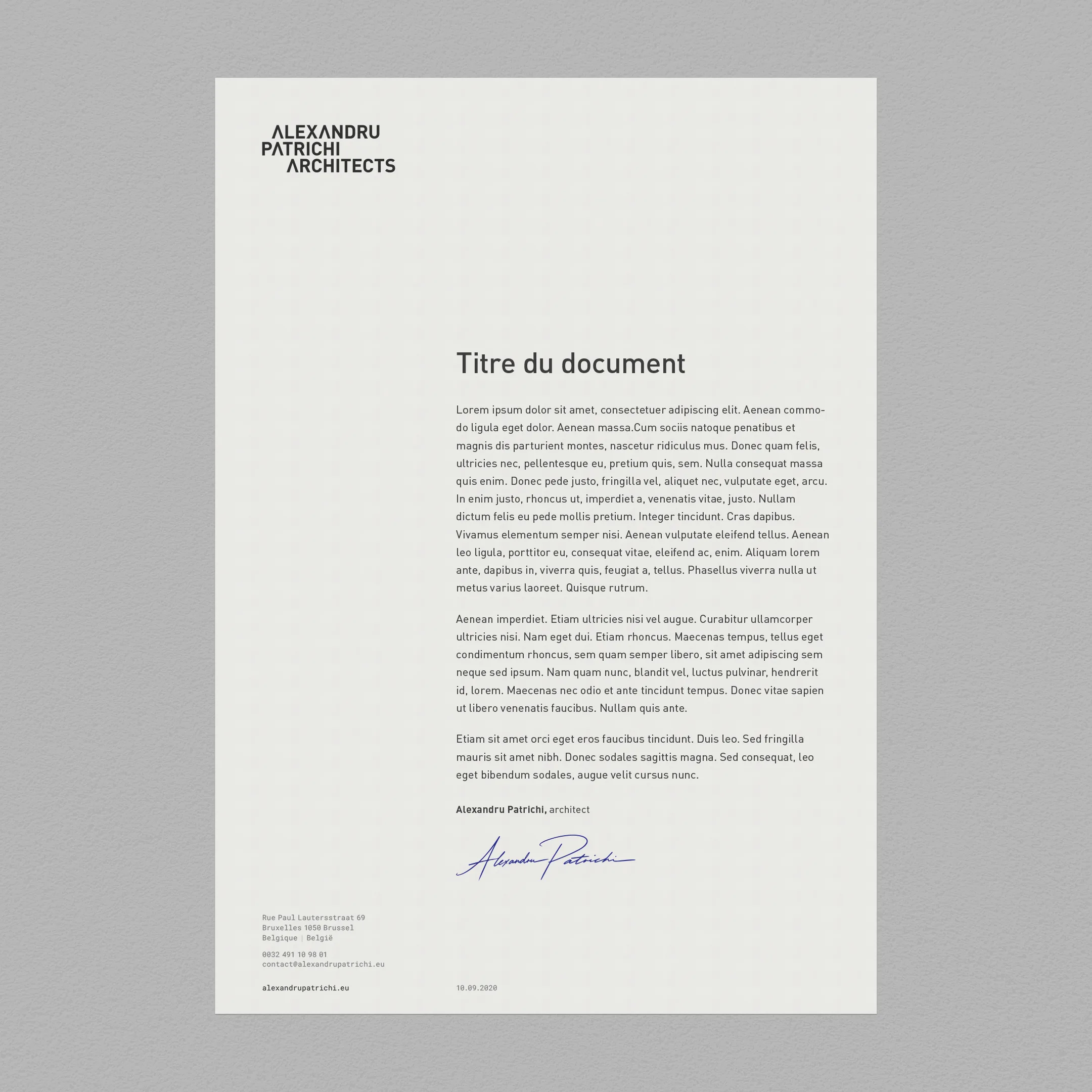
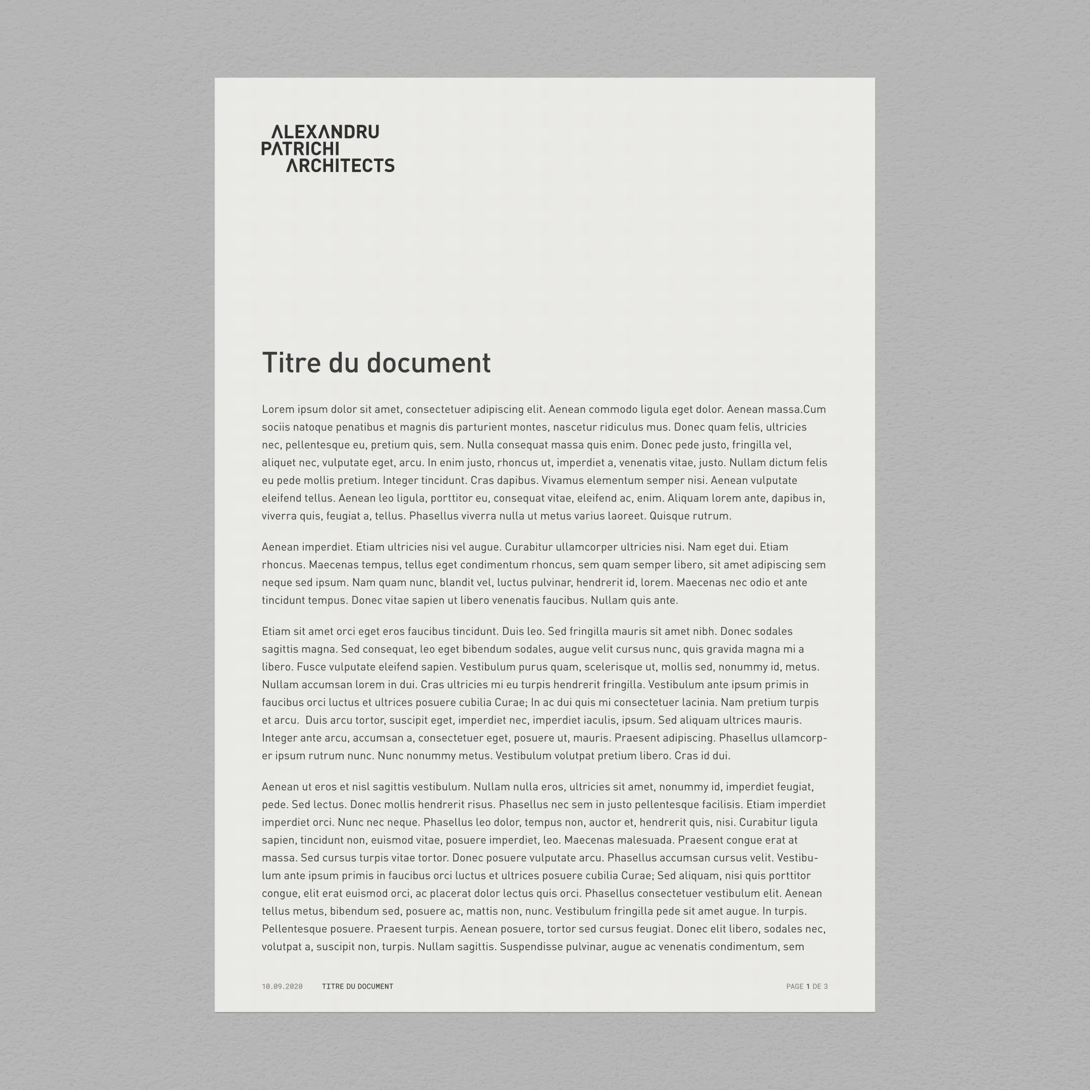
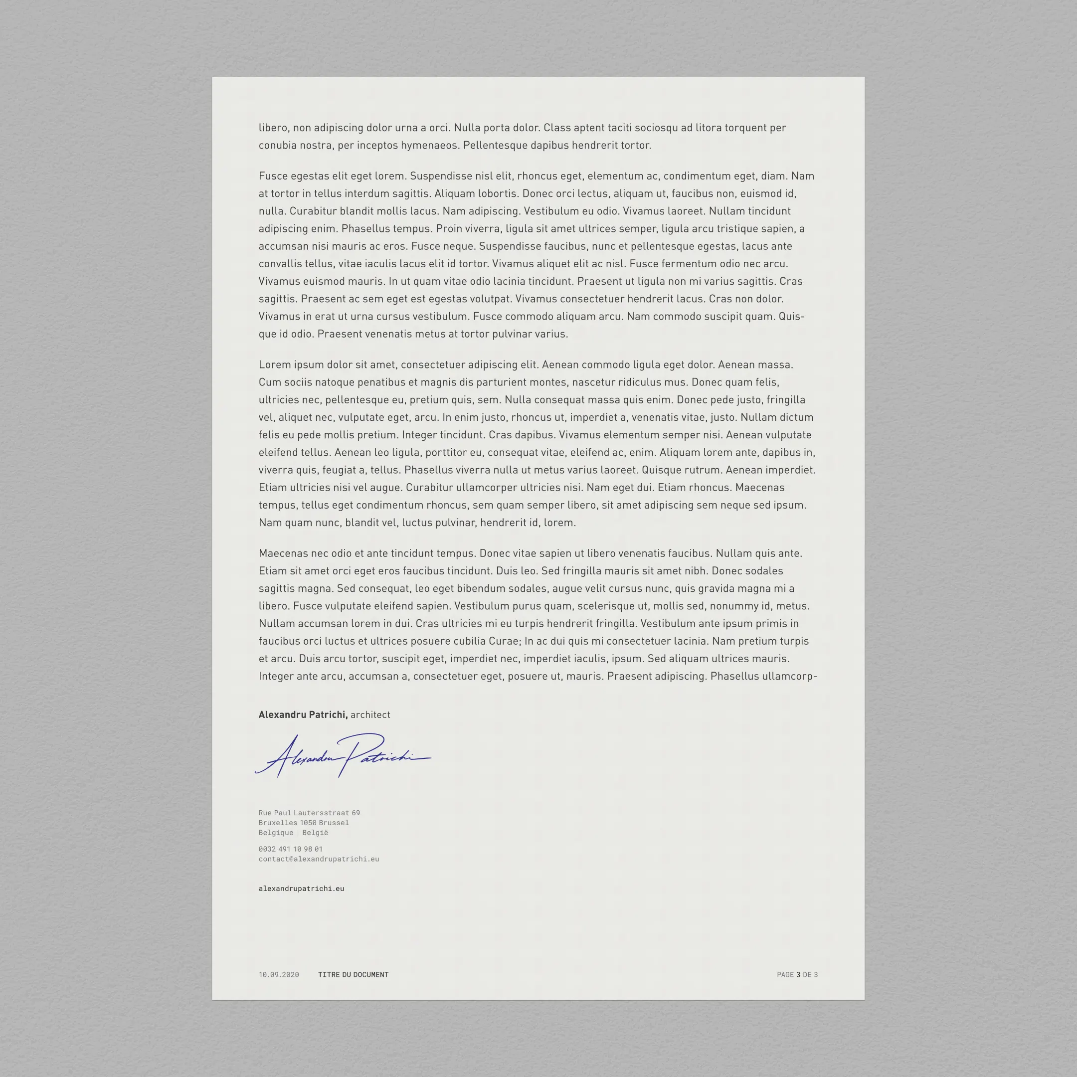
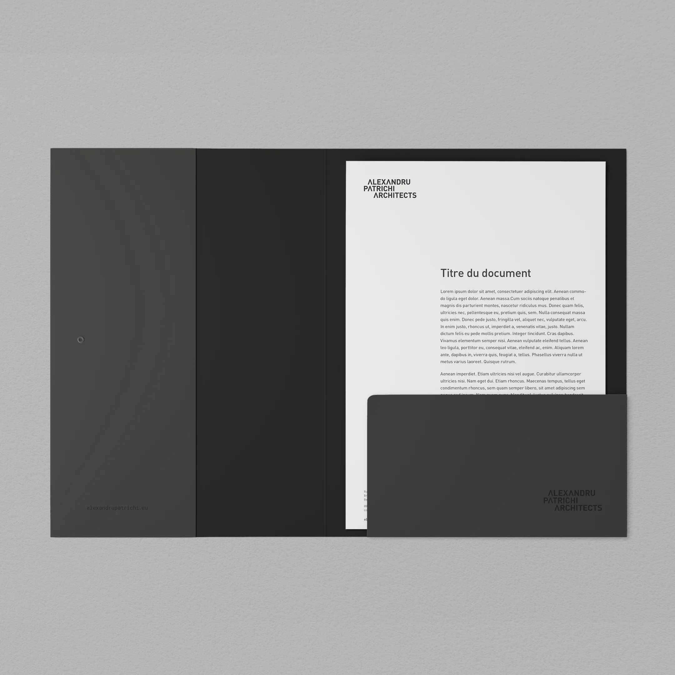
A simple grid-based letterhead, part of a coherent stationery system, built to accommodate both single-page documents and extended documentation. Consistent, clear and functional.
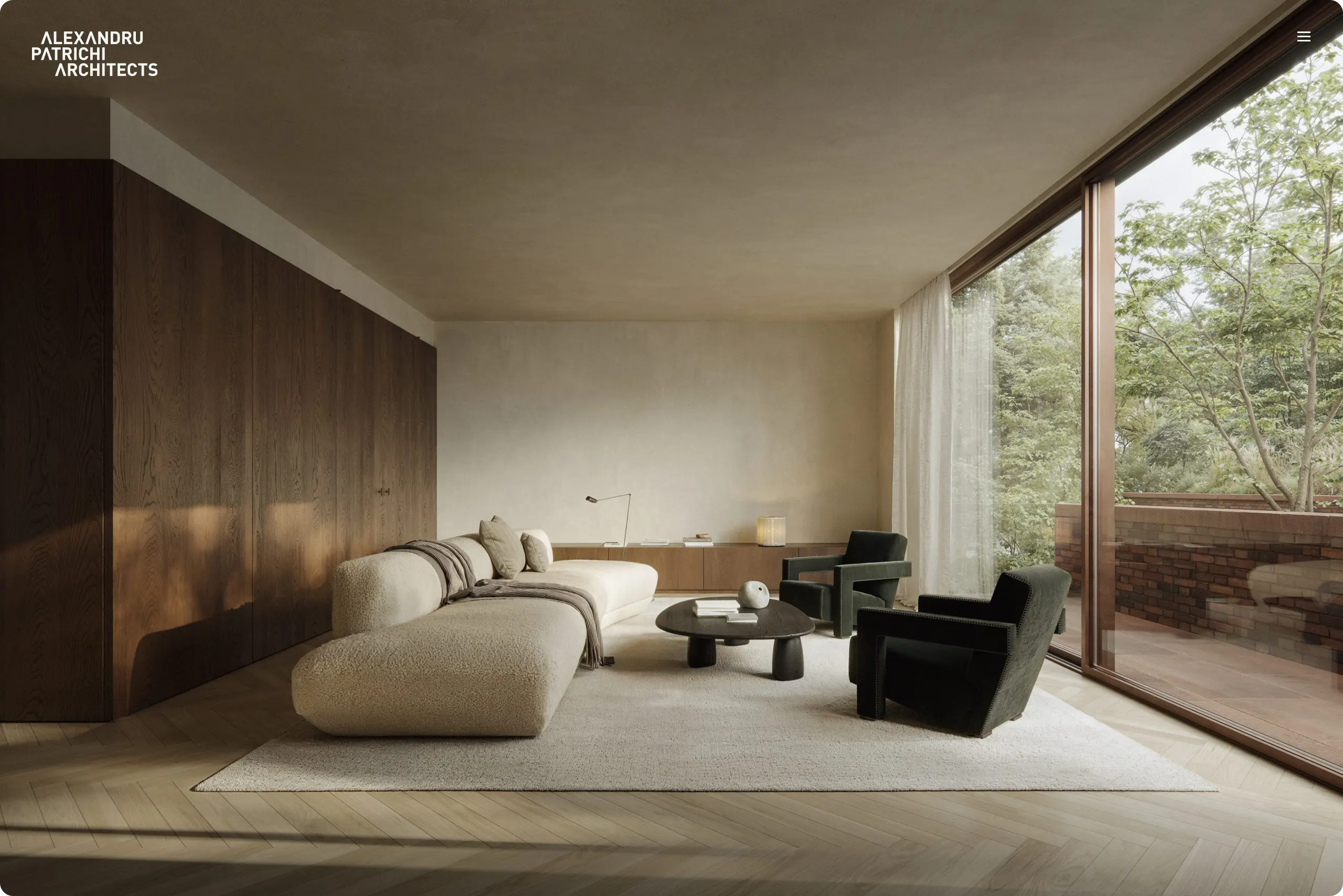
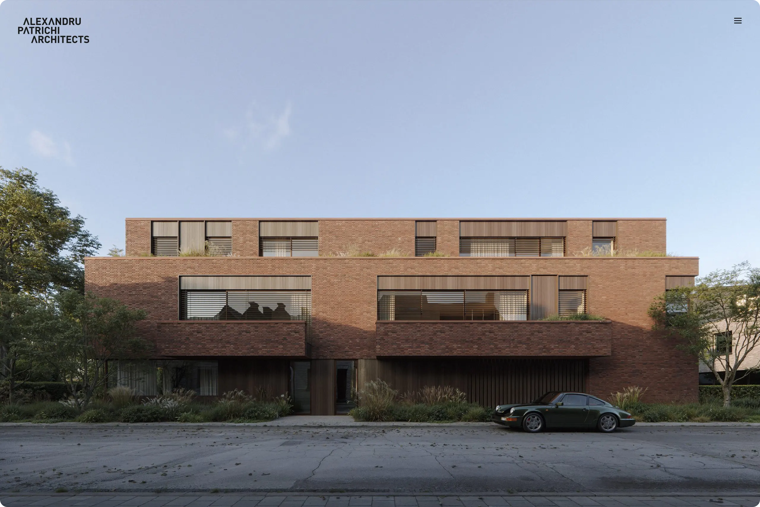
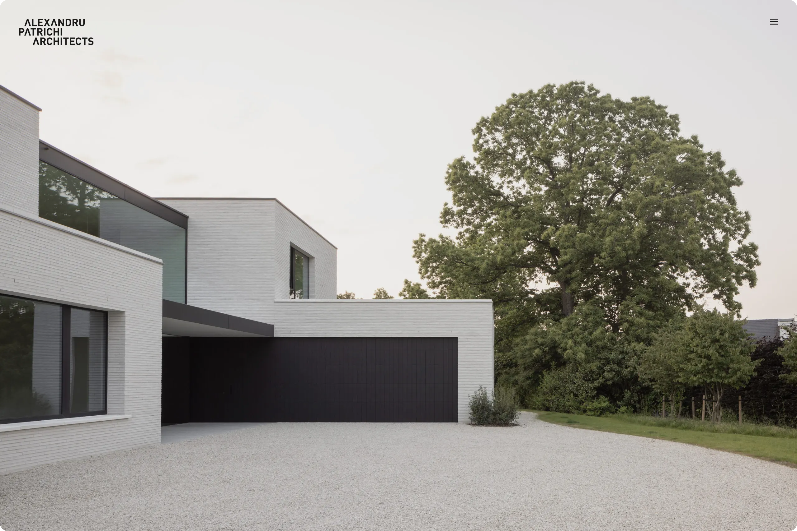
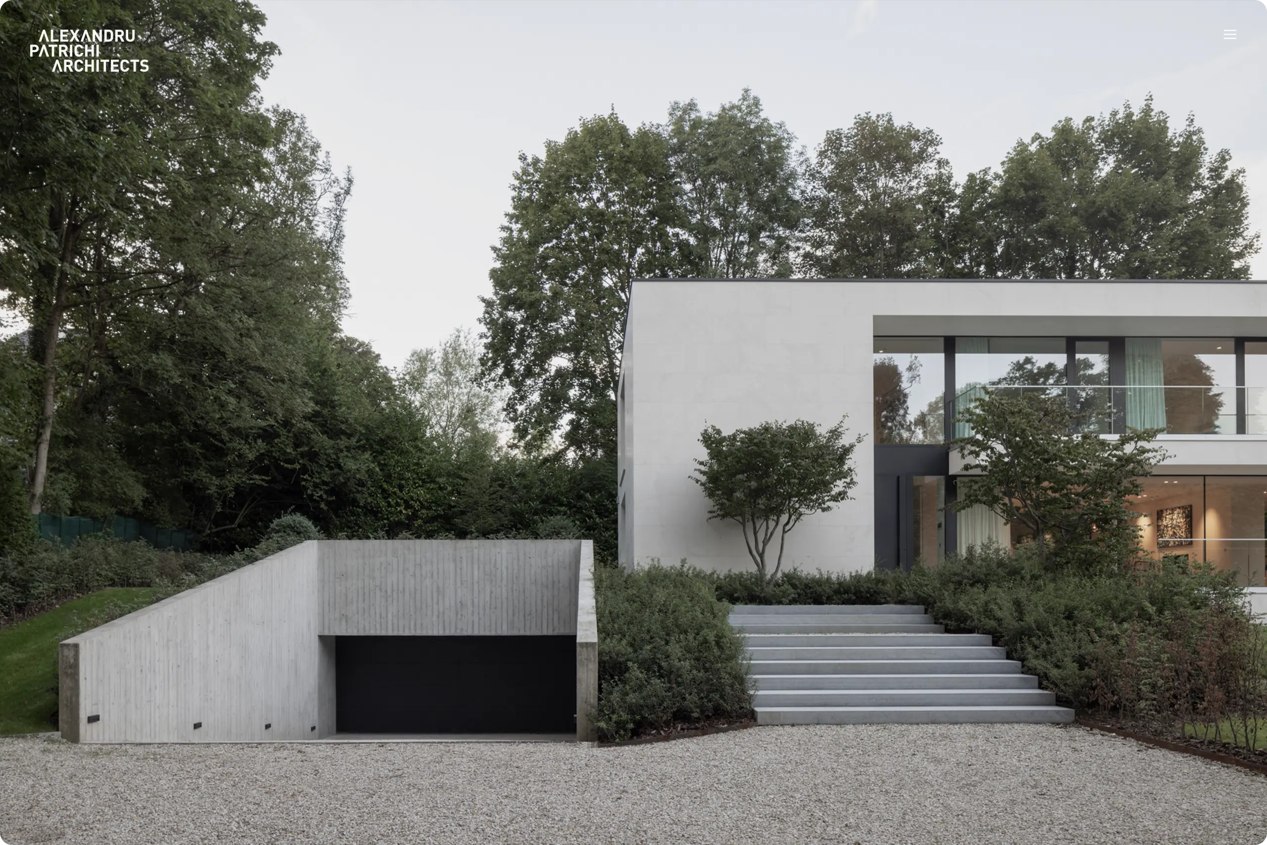
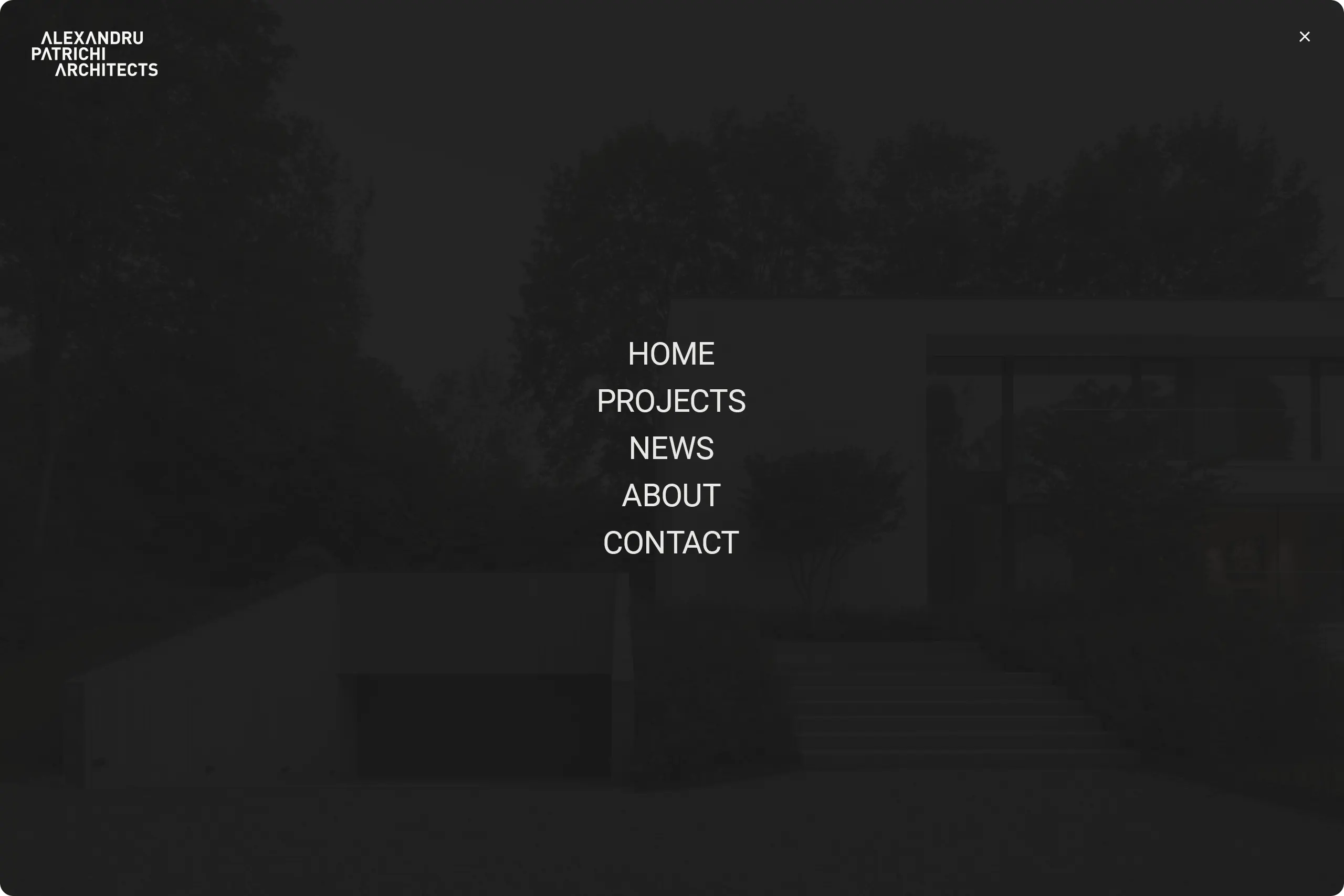
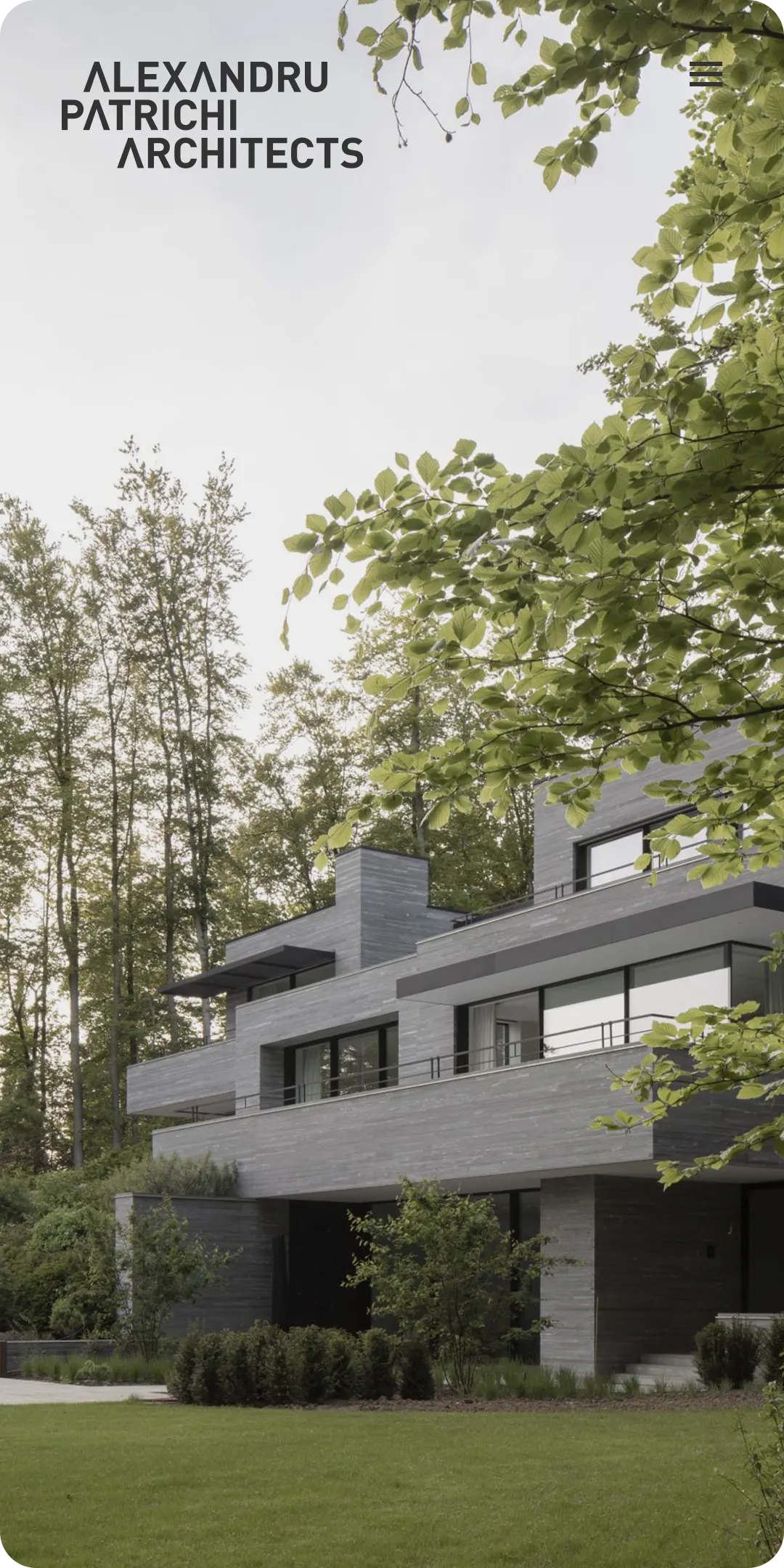
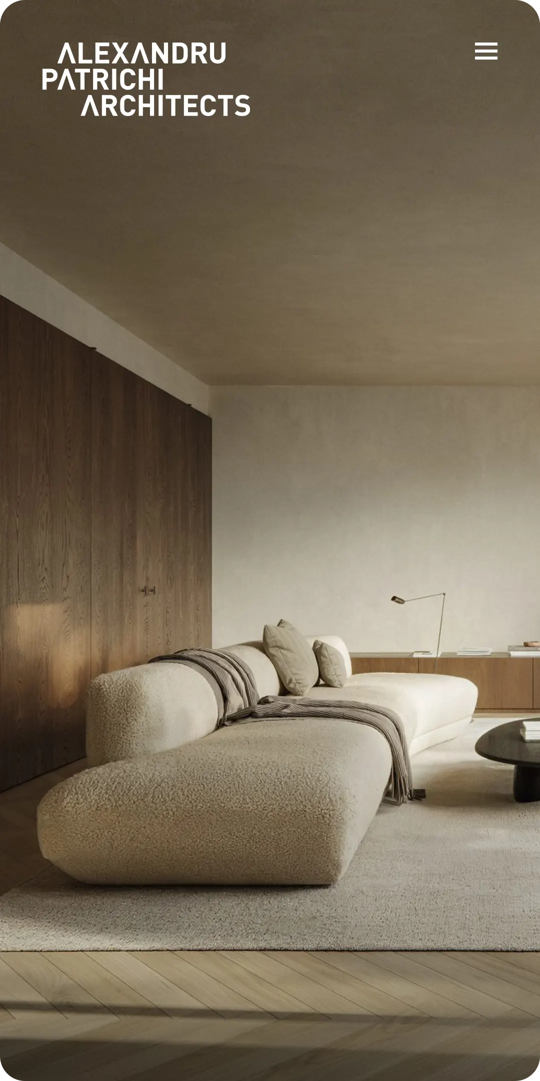
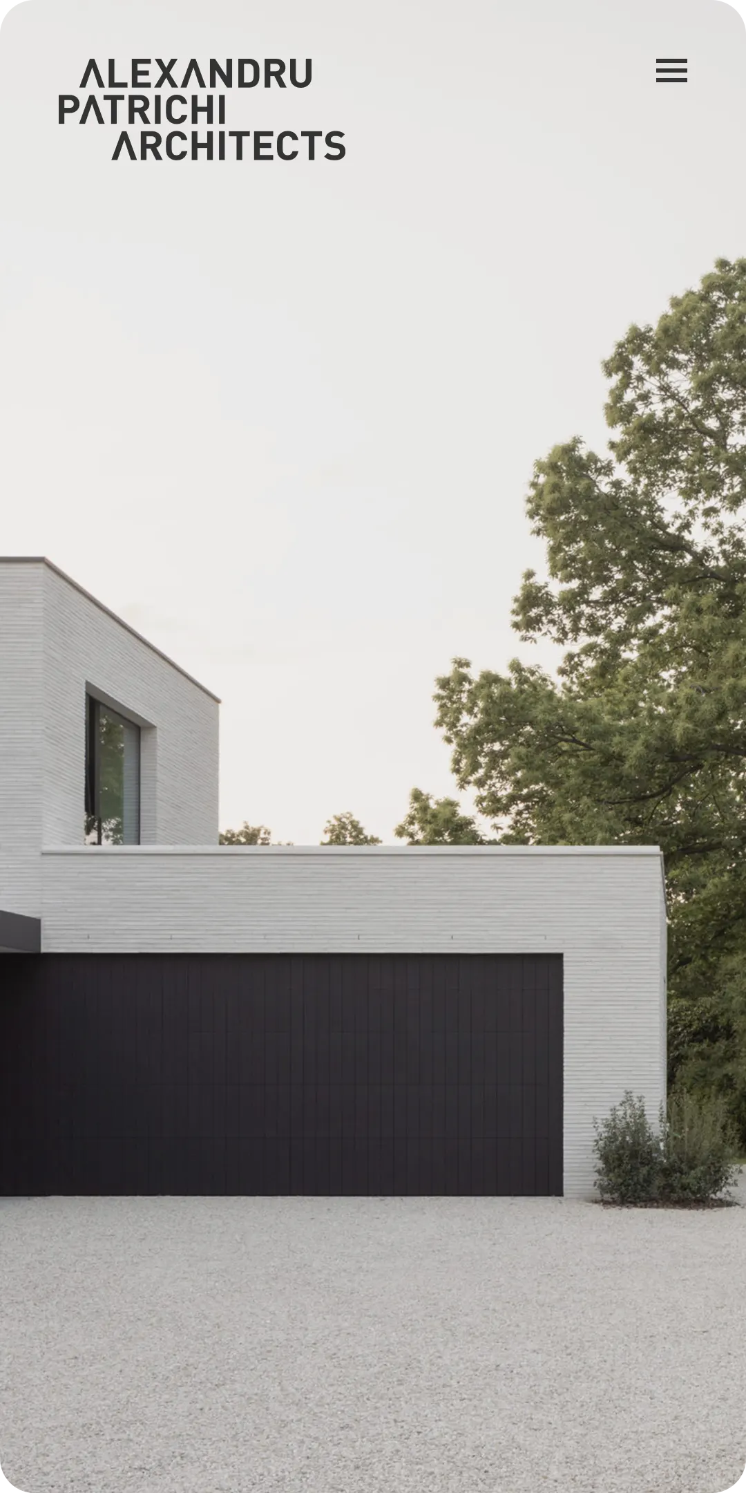
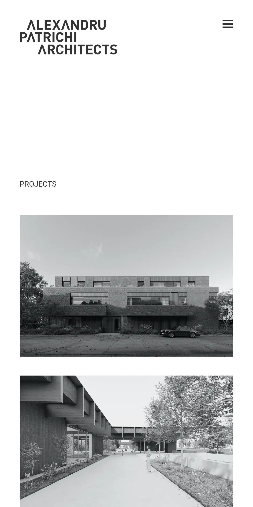
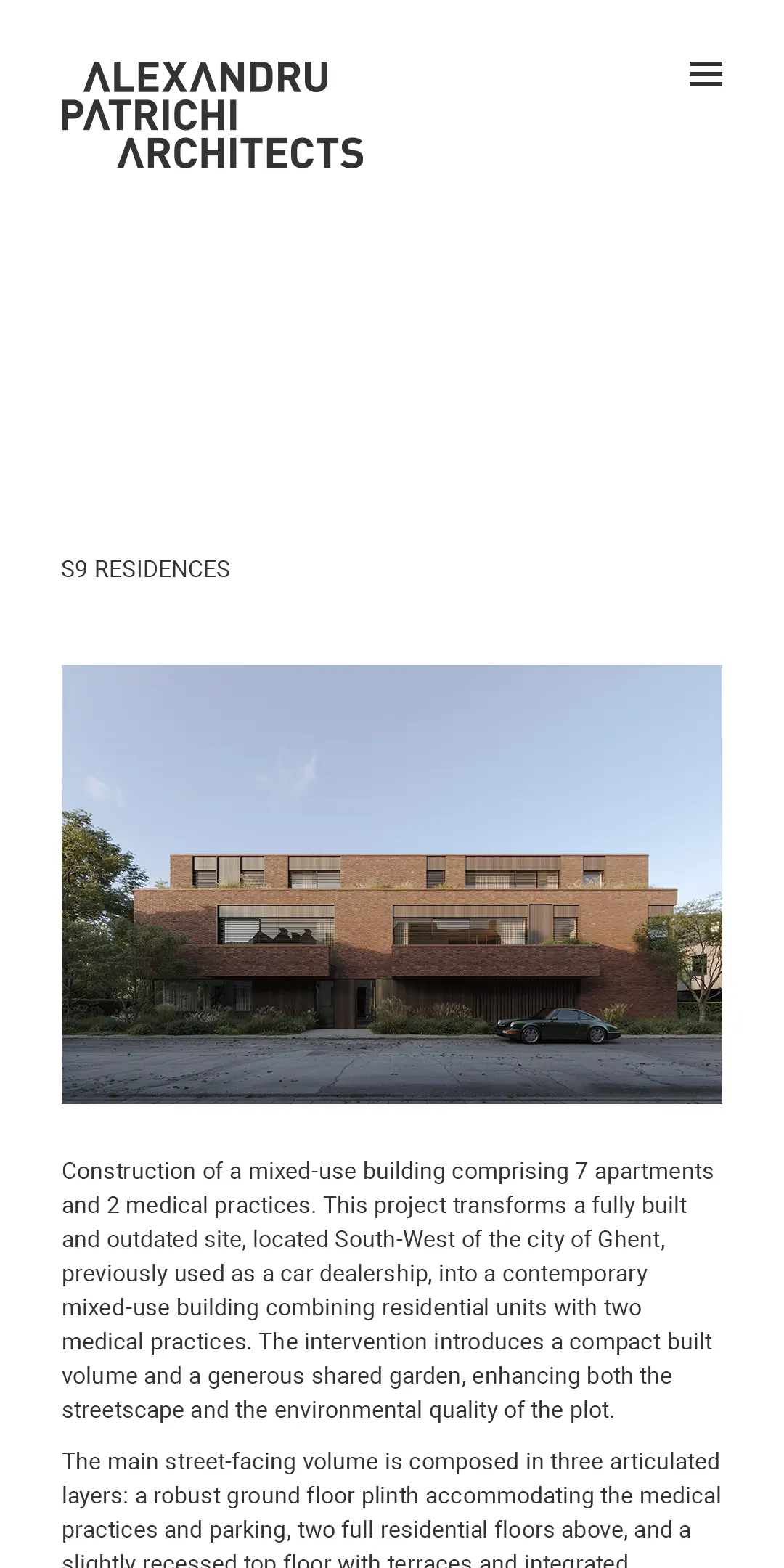
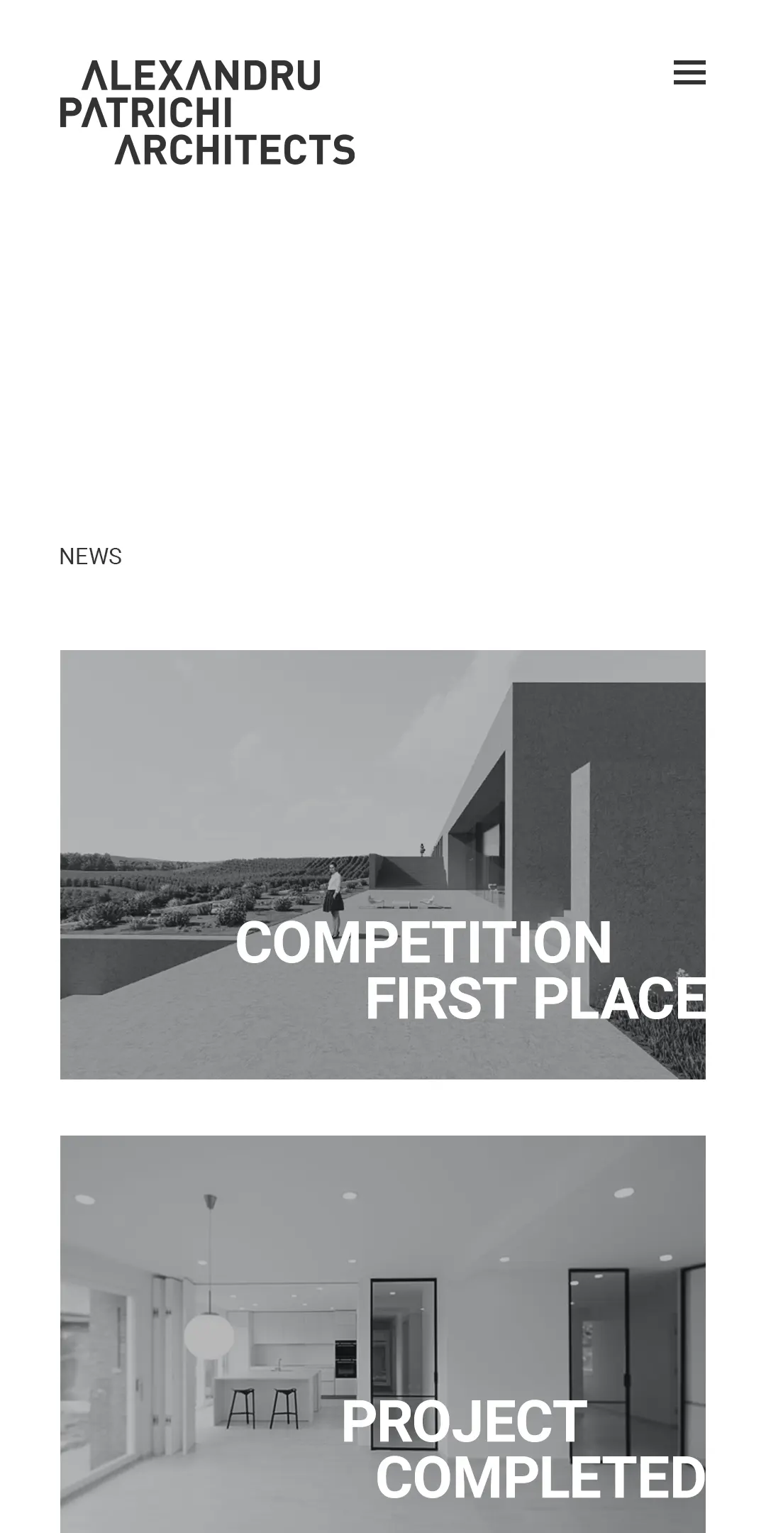
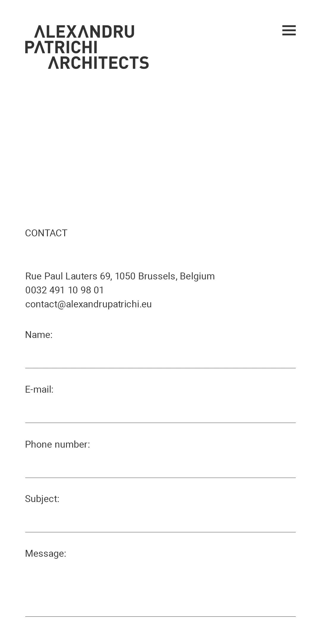
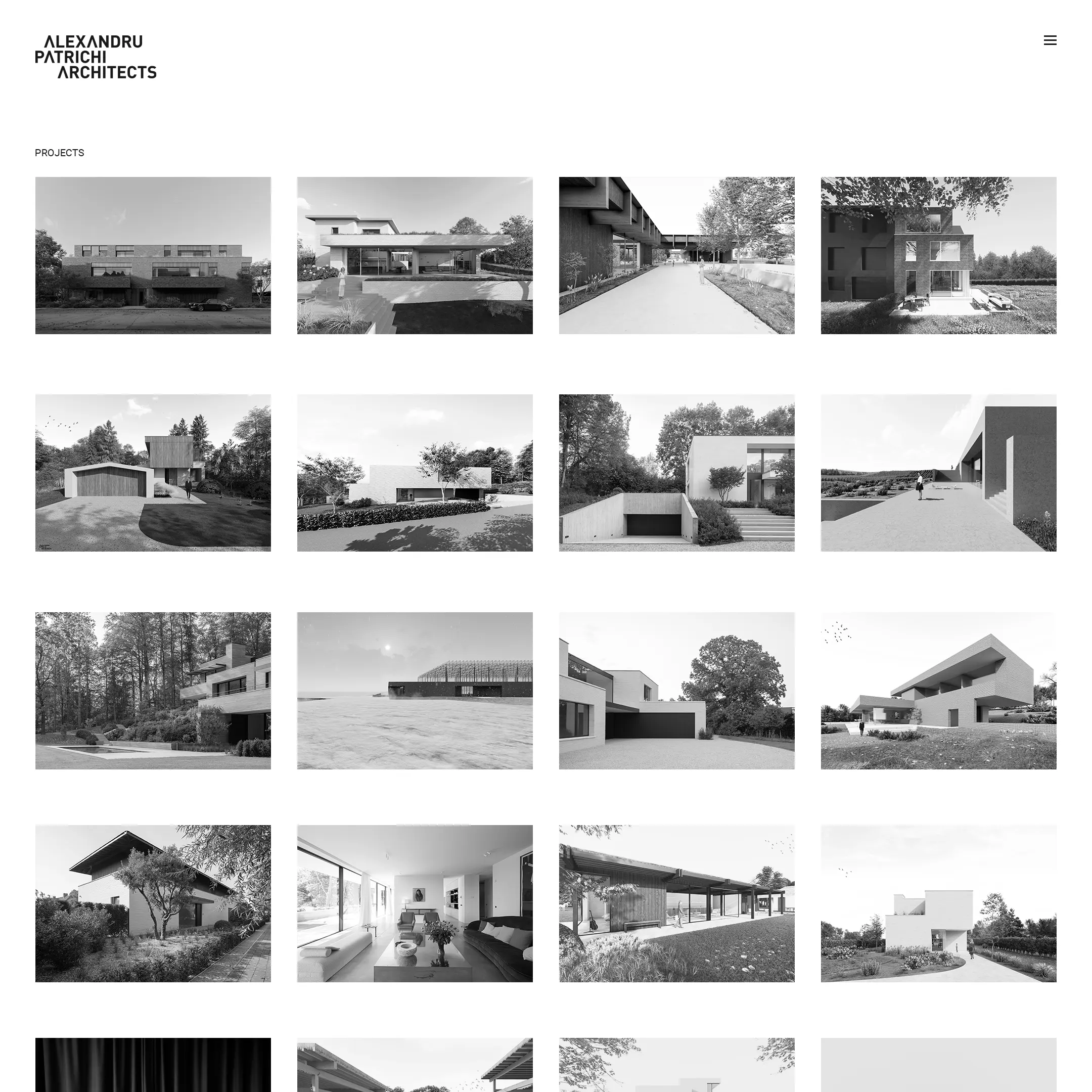
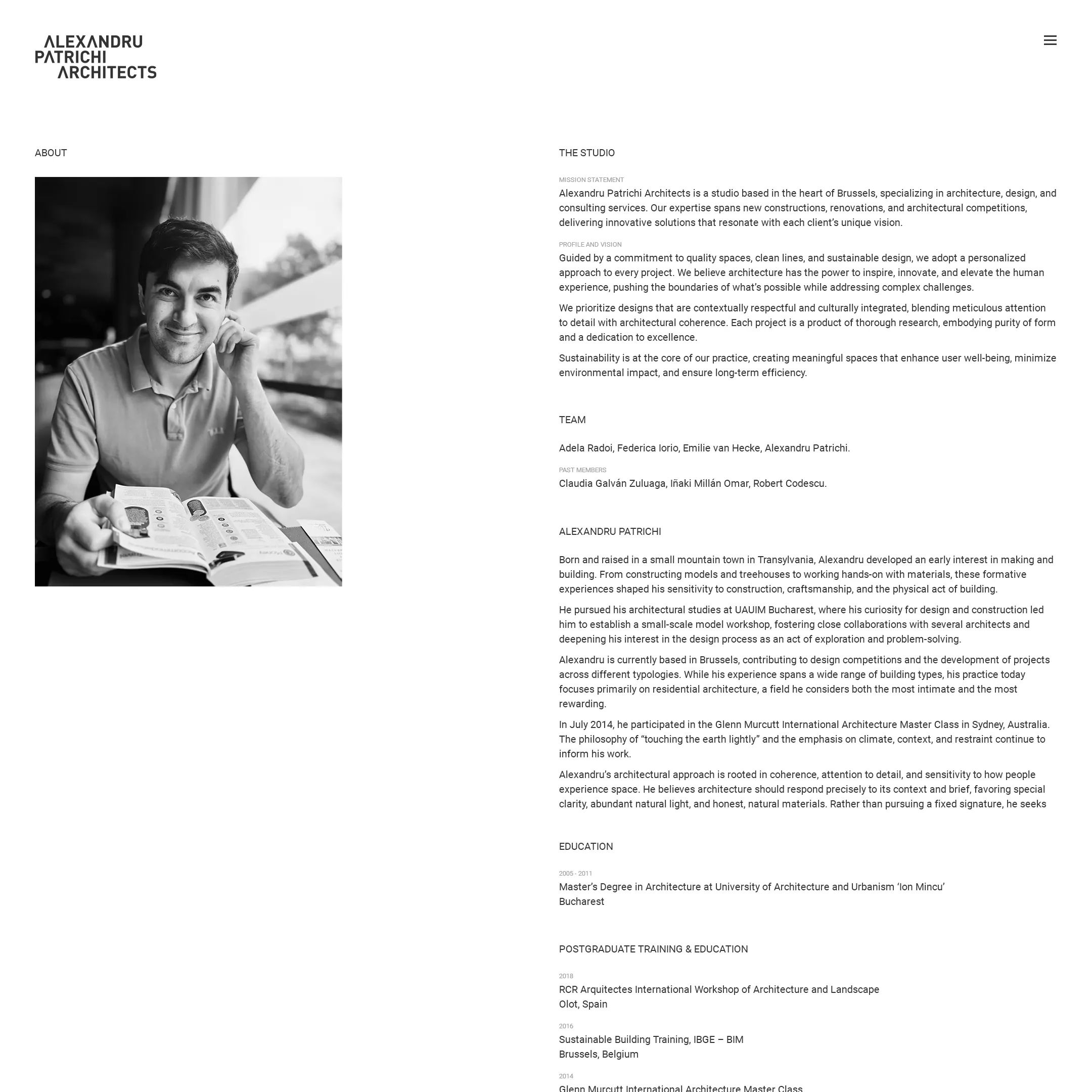
Designed and developed for the Brussels-based practice, the website follows a restrained architectural language — generous negative space, precise typography, and carefully sequenced imagery. A calm, controlled framework that lets the work speak.